
Background
As Xplor’s Fitness & Wellbeing division aimed to unify and elevate its digital presence, the TrueCoach platform faced the challenge of integrating with a newly developed design system—Apollo Design System. We had limited resources given to this initiative. The existing TrueCoach web interface was fragmented, with inconsistent navigation, outdated color schemes, and a lack of cohesion in its information architecture. This inconsistency not only hindered user experience but also impeded the platform's ability to scale and adapt to new features.
The goal was to overhaul the TrueCoach interface to align with Apollo's design principles while preserving TrueCoach’s unique brand identity. This required a comprehensive redesign of major elements, including navigation, color systems, and overall information architecture. The challenge was further complicated by the need to deliver these updates efficiently without disrupting ongoing projects or impacting the current user experience.
Main Navigation and Information Architecture
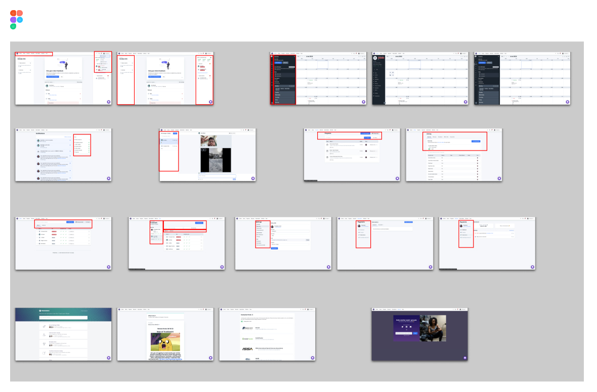
We first had to find all the places in the app that were going to have to change. Aside from the top anchor navigation, there was zero consistency of information architecture or navigation scheme.
Because we have thousands of daily active users, we didn't want to disrupt them completely if we didn't have to. Or at least, not for something "worse" in their eyes. So, We designed a top vs left nav usability test and deployed it to the users. This is a common practice I employ for features that have ambiguity or just need answered by the users. Build clickable prototypes and put them in front of folks. For TrueCoach, the average response rate is about ~500 users per survey or usability test.
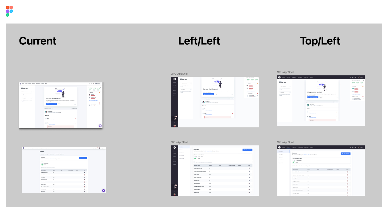
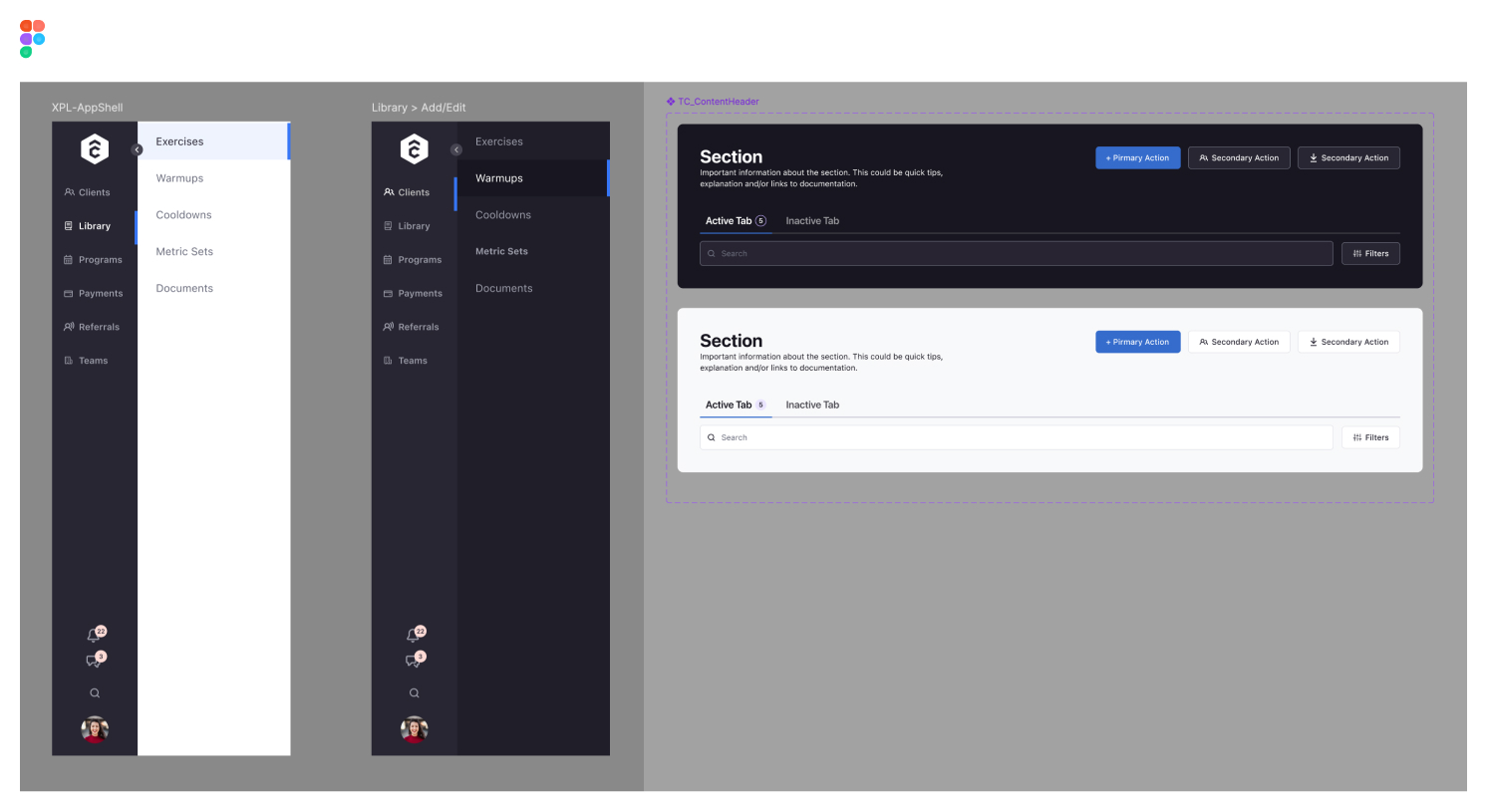
I redesigned and componentized the navigation system with variants within Figma for use within Figma application shells.
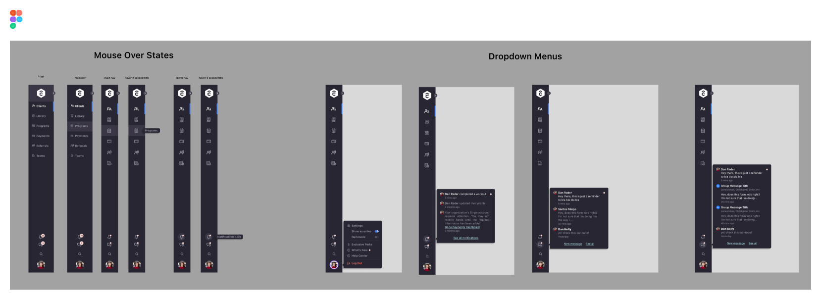
The redesign included a responsive navigation system with scalable views for full-screen, collapsed, and mobile layouts.
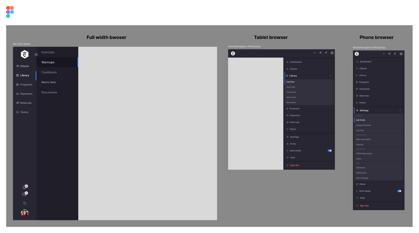
Along with the main navigation, we also needed to redesign the top level content navigation and information architecture. This includes header, subheader, main and secondary page actions, search and content filtering functionality, and content navigation elements like pagination.
Color System
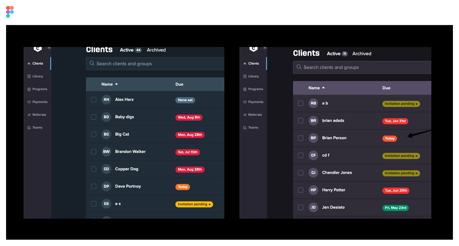
Once we had implemented the new navigation, it used Apollo+TrueCoach colors, but the rest of the website did not. This was an issue for me, but we didn't have the resouces to pull developers just to update some colors in CSS across the web platform. I decided to personally update the color system to integrate Apollo's color palette while maintaining TrueCoach's brand identity. Since a direct 1-to-1 match was not feasible, I carefully adjusted the Apollo colors to create a harmonious look that aligned with TrueCoach’s visual style.
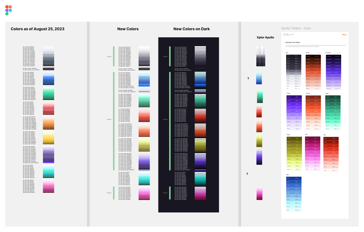
To expedite the integration, I personally updated the front-end code outside of the regular sprint cycle, ensuring a faster and more efficient delivery of the new color scheme.
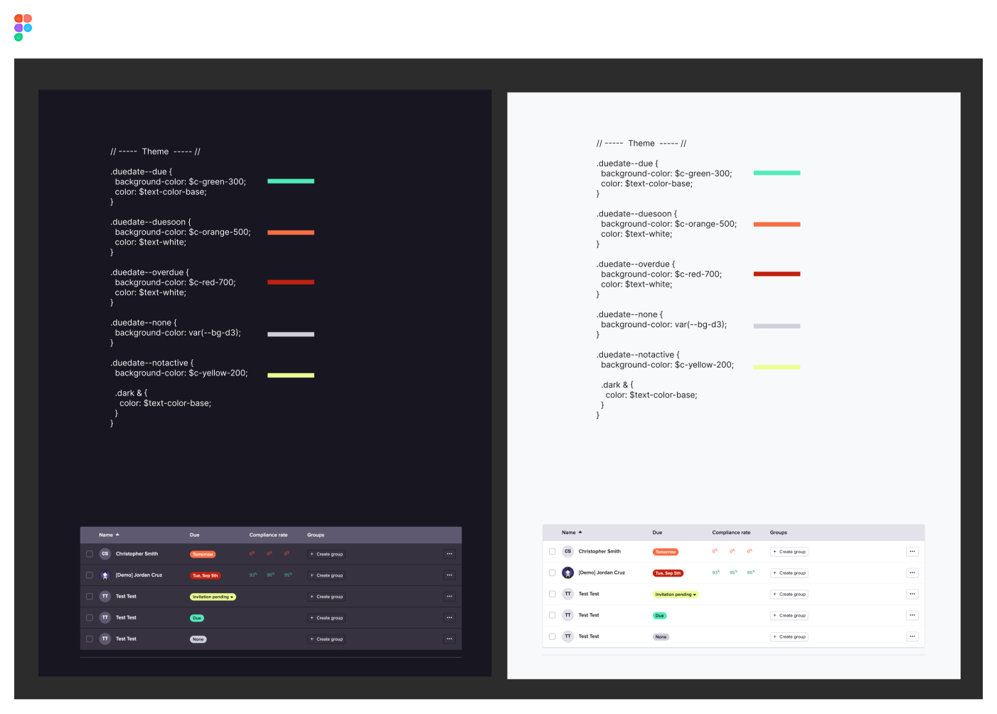
Once rolled out, we got a handful of slightly mad coaches saying that the contrast for one of their most used features was now off. It was my fault for the oversight, so as soon as we saw the messages come in through intercom, I went to work to adjust those specific colors within the app that had to do with compliance and sentiment.
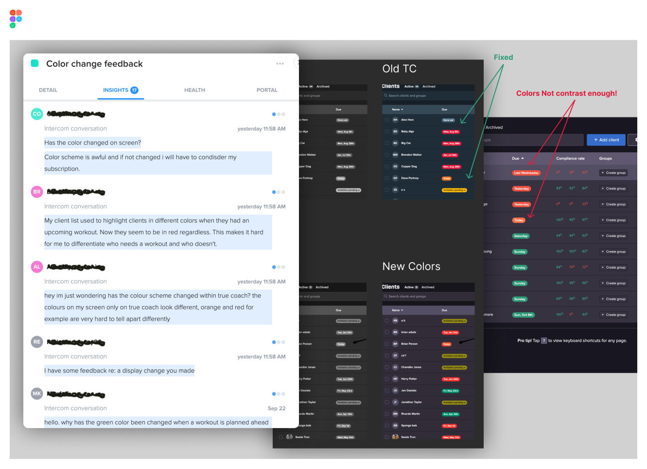
Within a matter of hours, I was able to address the concerns and push up a pull request (PR) to fix the issues myself. Luckly, we didn't have any issues after that point and in the case of a base color change, no news is good news.
Now the product has a seamless UI design base that's mostly Apollo making it easier for the component libraries to be shared across the Xplor products.
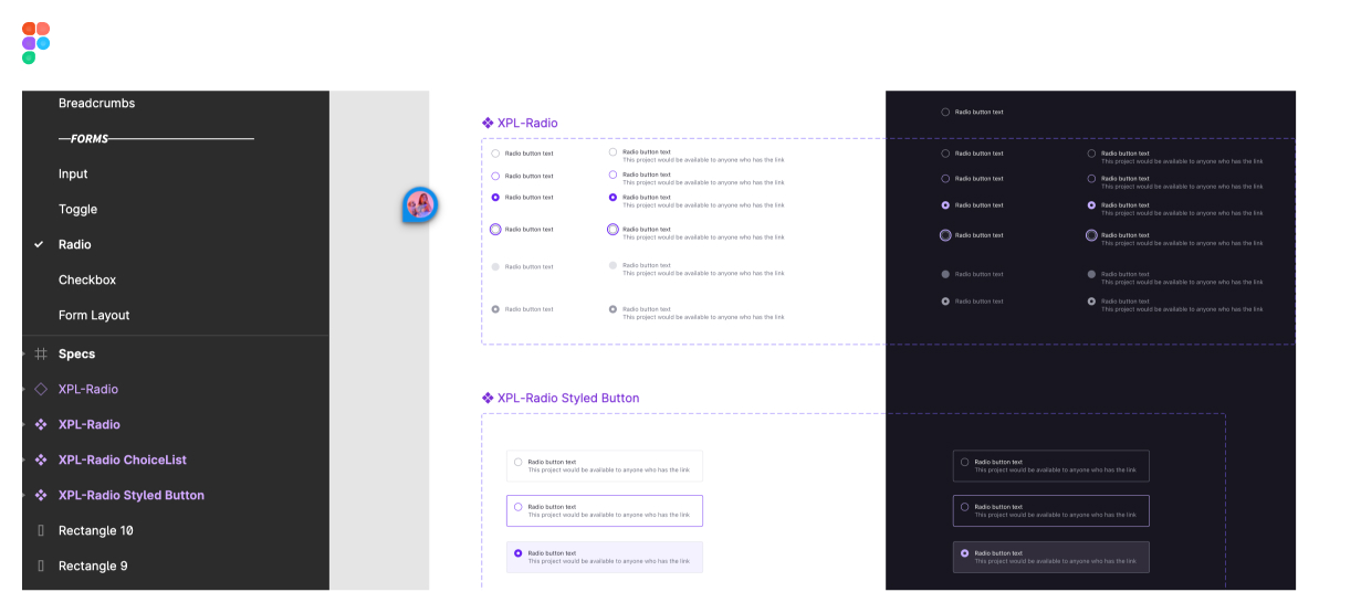
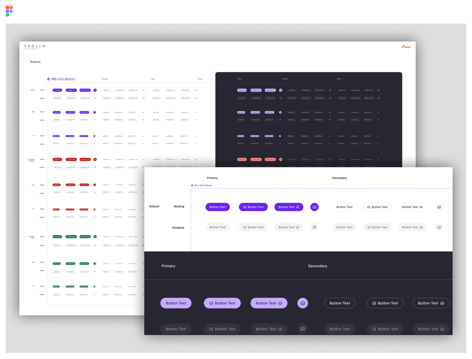
Apollo Design System Integration
Our Product Design Team developed the Apollo Design System for Xplor’s Fitness & Wellbeing division. Each team member played a crucial role in crafting and adapting the core system to meet the needs of various brands within the organization. Our contribution involved merging Apollo's design principles with TrueCoach's requirements, ensuring a consistent and high-quality user experience across platforms.
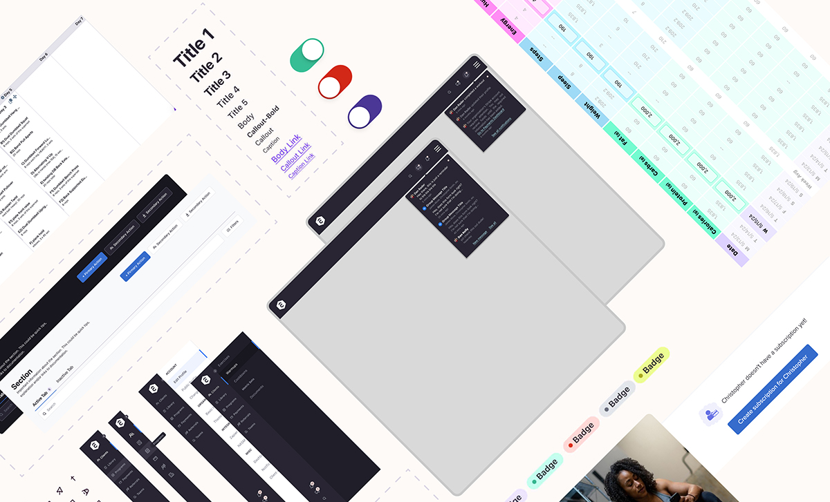
Although I don't want to explain this entire design system here in my portfolio, I'll drop a couple of screenshots. If you want to learn more about Apollo, reach out and I can give you some links.
Results
Although it's hard to quantify design efforts that are strictly based on information architecture and visual design with churn, conversion and other hard metrics. It's easy to see the difference that it makes with brand equity, NPS customer feedback about "design quality" and sentiment about the overall design of a product.
- Consistently delivered visually noticable updates to the software that coaches are using daily, giving them a sense of trust that we're listening to their feedback
- Navigation restructure makes for a easier feature findability for new users, but even for experienced users who couldn't find certain features
- We created a visually appealing and functionally robust interface that supports the platform's growth and future development
- Streamlined navigation and updated color system contributed to improved usability and user satisfaction
- Integration of the Apollo Design System into TrueCoach's web interface resulted in a more intuitive and cohesive user experience
- Inspired new components for the Apollo Design System that can now be used on the greater Xplor design team
What I've learned personally
- Although it's not usually the prefered method, by circumventing the standard sprint process and working directly with a senior front-end engineer, I was able to accelerate the implementation of these changes, enabling us to deliver enhancements without interrupting ongoing projects. Felt a little startupy, but I'm here to get things done and leave things better than how I found them.
- Maintaining a design system takes dedicated resources otherwise it becomes more of a "design guideline" and users borrow components just to disassemble them
- Building a couple Figma plugins to reflow data into complex components and see how they may fall apart with "too much text" was a huge win for me and my team
Thanks for reading 🎉
If there is anything you'd like further clarification on or are just kinda curious, feel free to reach out to me.